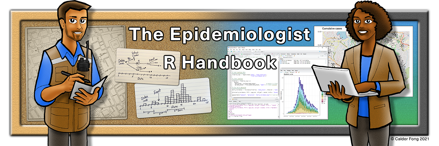
The Epidemiologist R Handbook
Welcome
R for applied epidemiology and public health
Usage: This handbook has been used over 3 million times by 850,000 people around the world.
Objective: Serve as a quick R code reference manual (online and offline) with task-centered examples that address common epidemiological problems.
Are you just starting with R? Try our free interactive tutorials or synchronous, virtual intro course used by US CDC, WHO, and 400+ other health agencies and Field Epi Training Programs worldwide.
Languages: French (Français), Spanish (Español), Vietnamese (Tiếng Việt), Japanese (日本), Turkish (Türkçe), Portuguese (Português), Russian (Русский)
Written by epidemiologists, for epidemiologists
![]()
Applied Epi is a nonprofit organisation and grassroots movement of frontline epis from around the world. We write in our spare time to offer this resource to the community. Your encouragement and feedback is most welcome:
- Visit our website and join our contact list
-
[email protected], tweet @appliedepi, or LinkedIn
- Submit issues to our Github repository
We offer live R training from instructors with decades of applied epidemiology experience - www.appliedepi.org/live.
How to use this handbook
- Browse the pages in the Table of Contents, or use the search box
- Click the “copy” icons to copy code
- You can follow-along with the example data
Offline version
See instructions in the Download handbook and data page.
Acknowledgements
This handbook is produced by an independent collaboration of epidemiologists from around the world drawing upon experience with organizations including local, state, provincial, and national health agencies, the World Health Organization (WHO), Doctors without Borders (MSF), hospital systems, and academic institutions.
This handbook is not an approved product of any specific organization. Although we strive for accuracy, we provide no guarantee of the content in this book.
Contributors
Editor: Neale Batra
Authors: Neale Batra, Alex Spina, Paula Blomquist, Finlay Campbell, Henry Laurenson-Schafer, Isaac Florence, Natalie Fischer, Aminata Ndiaye, Liza Coyer, Jonathan Polonsky, Yurie Izawa, Chris Bailey, Daniel Molling, Isha Berry, Emma Buajitti, Mathilde Mousset, Sara Hollis, Wen Lin
Reviewers and supporters: Pat Keating, Amrish Baidjoe, Annick Lenglet, Margot Charette, Danielly Xavier, Marie-Amélie Degail Chabrat, Esther Kukielka, Michelle Sloan, Aybüke Koyuncu, Rachel Burke, Kate Kelsey, Berhe Etsay, John Rossow, Mackenzie Zendt, James Wright, Laura Haskins, Flavio Finger, Tim Taylor, Jae Hyoung Tim Lee, Brianna Bradley, Wayne Enanoria, Manual Albela Miranda, Molly Mantus, Pattama Ulrich, Joseph Timothy, Adam Vaughan, Olivia Varsaneux, Lionel Monteiro, Joao Muianga
Illustrations: Calder Fong
Funding and support
This book was primarily a volunteer effort that took thousands of hours to create.
The handbook received some supportive funding via a COVID-19 emergency capacity-building grant from TEPHINET, the global network of Field Epidemiology Training Programs (FETPs).
Administrative support was provided by the EPIET Alumni Network (EAN), with special thanks to Annika Wendland. EPIET is the European Programme for Intervention Epidemiology Training.
Special thanks to Médecins Sans Frontières (MSF) Operational Centre Amsterdam (OCA) for their support during the development of this handbook.
This publication was supported by Cooperative Agreement number NU2GGH001873, funded by the Centers for Disease Control and Prevention through TEPHINET, a program of The Task Force for Global Health. Its contents are solely the responsibility of the authors and do not necessarily represent the official views of the Centers for Disease Control and Prevention, the Department of Health and Human Services, The Task Force for Global Health, Inc. or TEPHINET.
Inspiration
The multitude of tutorials and vignettes that provided knowledge for development of handbook content are credited within their respective pages.
More generally, the following sources provided inspiration for this handbook:
The “R4Epis” project (a collaboration between MSF and RECON)
R Epidemics Consortium (RECON)
R for Data Science book (R4DS)
bookdown: Authoring Books and Technical Documents with R Markdown
Netlify hosts this website
Terms of Use and Contribution
License
 Applied Epi Incorporated, 2021
This work is licensed by Applied Epi Incorporated under a Creative Commons Attribution-NonCommercial-ShareAlike 4.0 International License.
Academic courses and epidemiologist training programs are welcome to contact us about use or adaptation of this material (email [email protected]).
Citation
Batra, Neale, et al. The Epidemiologist R Handbook. 2021. ![]()
Contribution
If you would like to make a content contribution, please contact with us first via Github issues or by email. We are implementing a schedule for updates and are creating a contributor guide.
Please note that the epiRhandbook project is released with a Contributor Code of Conduct. By contributing to this project, you agree to abide by its terms.